
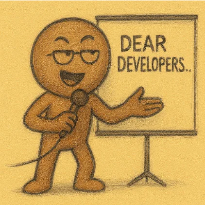
Welcome to My TED Talk: A Satirical Rant to App Developers
I come to you not as a developer, but as a survivor. A survivor of updates, icons, and pricing schemes so convoluted they make airline fees look honest.
Part 1: The Update Tsunami
Let's talk about Google. The company that updates its apps more often than I hydrate. Chrome, Maps, Gmail — each one gets a refresh every two to three days. And then there's Google Partner Setup, which sounds like a dating app for devices. I don't know what it does. I can't open it. But it updated yesterday and again this morning.
You open Gmail. The Compose button has moved. You open Maps. The search bar now floats. You open Calendar. It's asking how you feel about Tuesdays.
Reddit updated. No changelog. No explanation. Just a button that says "Update." You tap it. The comment sort breaks. Again.
X (formerly Twitter) updated. No notes. No context. Just a new icon and a vague promise that your experience has been enhanced. You open it. The tab bar has shifted. The notifications are louder. The existential dread remains.
YouTube Music updated. No description. YouTube Create updated. It's still in beta. It still wants 4GB of RAM. It still doesn't know what it wants to be.
Microsoft? Oh, they're subtler. They wait until you're emotionally attached to a feature, then quietly retire it. "My Day"? Gone. "Help Me Create"? Vanished. Your organization logo? Hidden like a shameful secret.
Part 2: Icon Drift & Name Blur
You survived the updates. You braced for the changelogs. But now comes the real test: recognizing your apps. Because the icon you trusted yesterday has been rebranded, recolored, and possibly renamed. It's still on your tablet. It's just wearing someone else's face.
This is not a redesign. This is a genre betrayal. Your dock becomes a guessing game. You tap an icon and pray it's not a ghost app.
Microsoft 365 is now Microsoft 365 Copilot. The icon changed. The header disappeared. The "Back" button? Retired like a disgraced senator.
Dropbox. Once a clean blue box. Now it's a gradient swirl that looks like a meditation app. You tap it expecting files. It offers you a "Recents" feed and a suggestion to upgrade. You're not sure if you're syncing or centering yourself.
YouTube. YT Music. YT Kids. YT Create. Each one has its own icon, its own name, its own emotional tone. You open one expecting videos. It offers editing tools. You open another expecting music. It offers podcasts. You open a third and wonder if you've accidentally launched a parental control dashboard.
This is not a redesign. This is an identity crisis. Your app bar becomes a guessing game. You tap an icon and pray it's not a ghost app.
Part 3: Pricing: The App Store Casino
The iPad App Store lists ten different prices for the same app. $0.99, $1.99, $4.99, $7.99/month, $49/year, $99 lifetime, $2.99 for extra fonts, and $3.99 to remove the icon blur. You don't buy the app. You buy a relationship.
Google Play? Sometimes no price is listed. Sometimes it's $0.00 with a $122.99 surprise inside.
Final Slide: Thanks for Staying
To the developers who didn't walk out: thank you. You stayed through the icon drift, the pricing chaos, and the emotional logic breakdown. You didn't throw a changelog. You didn't rename your app mid-talk. You listened. That's all we ever wanted.